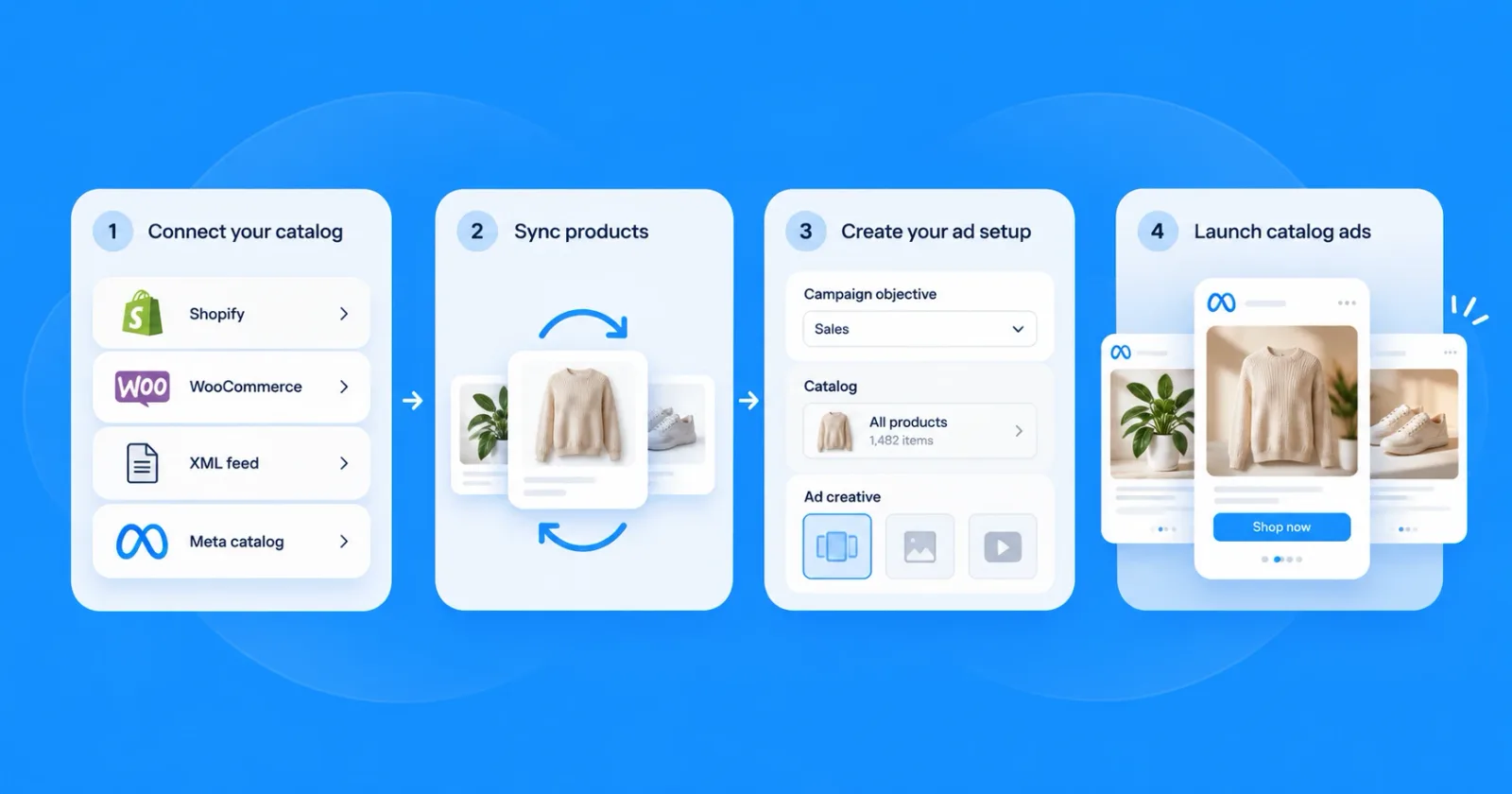
Catalog Ad Design Best Practices: 12 Rules for Creatives That Beat White Backgrounds
 Nikolett Lorincz8 min read

Open any shopping feed on Instagram and count the white backgrounds. Most catalog ads show the same packshot the store uses on its product page, the marketplace uses in its listing and the competitor uses in their ad.
That photo was made to describe a product, not to stop a scroll, and in a catalog ad it has to do both for every product in the feed.
This guide gives you 12 design rules for catalog ads, each with a real example, and shows what Meta's own tools can change. First, why the packshot blends in.
The short answer: to make catalog ads beat a white-background packshot, change what the shopper sees first. Put the product in a scene, call out one feature or the price, and keep the brand recognizable. Do it for every product, not one hero ad, and check that Advantage+ creative isn't overriding the design.
Why white-background catalog ads blend in
A catalog ad takes its image from your product feed. If the feed holds a packshot on white, every ad Meta builds from it looks like a product listing, and a listing is something people scroll past on the way to the next post.

The format also multiplies the problem. One catalog campaign can show thousands of products, so a weak image isn't one weak ad, it is the same weakness on every product.
Our complete guide to Meta catalog ads covers how the format works; this article is about the picture.
Ways to change the image
You have four places to change what a catalog ad looks like. Meta's tools change the layout around the feed photo, and your feed decides the photo itself.
| What it changes | Works on every product | Where it runs | Limits | |
|---|---|---|---|---|
| Frame (Ads Manager) | One graphic, such as a border or a logo, over every product photo | Yes | Facebook only, per Ads Manager | The same frame on every product; works best with transparent product photos |
| Dynamic overlays (Advantage+ creative) | Adds catalog data, such as the price, on top of the image | Yes | Where Meta decides to show it | You switch it on or off; you don't design it |
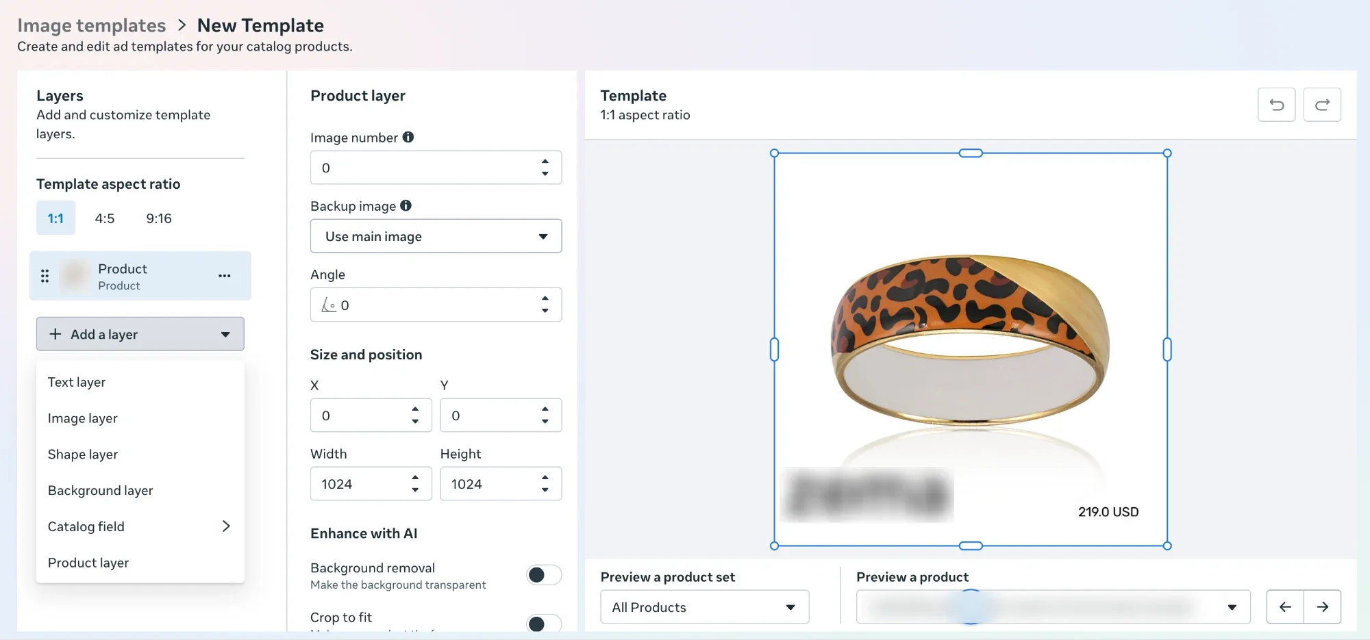
| Image templates (Commerce Manager) | A layered layout: background, product photo, text, shapes, catalog fields | Yes | 1:1, 4:5 and 9:16 layouts | One layout for every product, no rules by product type |
| A new image per product (in the feed) | The photo itself: a scene, a callout, a badge | Yes, once each product has one | Everywhere the catalog runs | Someone or something has to make an image for every product |
A Meta image template starts with a product layer and lets you add text, image, shape, background and catalog field layers on top. The product layer has an image number (0 is the main feed image), a backup image, size and position, and two AI switches: background removal and crop to fit. A preview pane steps through the products in a product set so you can see the layout on each one.
The fourth way changes more than the layout. OptiQube, our product, generates a new image for every product in the feed: a scene, a callout or a badge, in your brand's look. The examples in this article come from the OptiQube ad library.
The 12 rules
Each rule works with any of the four methods above. Where a method can't do it, the rule says so.
1. Put the product in a scene the shopper recognizes
A product on a table, in a hand or on a shelf tells the shopper what it is for before they read a word. Pick the moment of use, not a generic room: a serum being applied, a jacket in the snow, a blender on a busy kitchen counter.

Frames can't do this, and a template can only put a background behind the packshot: a real scene has to be in the photo. More scene-led examples are in the lifestyle catalog ad examples.
2. Show fit and scale
A packshot hides how big a bag is, how a pair of jeans falls or how a dress moves. Put the product on a person or next to something familiar, and keep a clean product view beside it so the details stay visible.

For apparel this is the rule that matters most; the clothing ad examples show it across styles.
3. Call out the one feature the photo can't show
Some reasons to buy are invisible: satellite connectivity, a mineral SPF, a dishwasher-safe jar. Two or three short labels pointing at the product say it faster than a paragraph of ad copy.

Keep each label to three or four words. If you need a sentence, it belongs in the primary text.
4. Put the price or the offer on the image when there is one
A sale, a bundle or a low entry price is a reason to click, and the image is where people see it first. Use only a real, current offer, and plan when the image changes back.
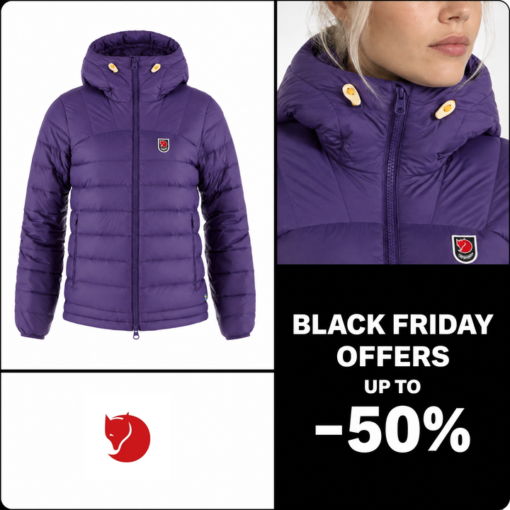
Meta's dynamic overlays and the catalog field layer in image templates read the price from the feed, so they update themselves. An offer that is part of the image, like the one above, has to be replaced when the sale ends. Without an offer, a feature (rule 3) usually says more than a plain price tag.
5. Keep the product the hero
Whatever you add, the product stays the largest, sharpest thing in the frame. A frame or badge that covers part of it, or a background busier than the product, turns the ad into decoration.

This is where frames often fail: one frame sits on top of thousands of different product photos, and some of them will be covered. Ads Manager's own note says frames work best when the product photo has a transparent background.
6. Make the brand recognizable
Someone who has visited your store should know the ad is yours before they read it. A consistent color, typeface or wordmark does that; it doesn't have to be a big logo.

Image templates are good at this: one background color and one text style across every product.
7. Keep text short and readable on a phone
Most catalog ads are seen on a phone, at the size of a thumb. One headline, a few large words and nothing smaller than you can read at arm's length.

If the image already carries the headline, the ad's headline field can say something else, such as the product name or the price.
8. Design for every shape
The same catalog ad can appear as a square in the feed, as a portrait on Instagram and full screen in Stories and Reels. Square (1:1) is the safe default; portrait (4:5) fills more of the mobile feed; 9:16 covers Stories and Reels, where Meta's controls sit over the top and bottom of the screen.
Meta's image templates offer exactly these three shapes, so build the layout three times or check that one layout survives the crop. Keep text and the product away from the top and bottom edges of the 9:16 version. The full numbers are in the image specs for catalog ads.
9. Change the scene with the season, not the product
A gingerbread scent in December, sunscreen in winter light, a jacket in the snow: the season changes the setting and the offer, and the product stays exactly as it is in the feed.

Plan the seasonal version before the season starts, because the catalog has to carry the new image when the campaign goes live. See the Christmas catalog ad examples and the Black Friday examples.
10. Use feed fields, but only accurate ones
Image templates can place catalog fields, such as the price or a custom label, straight onto the image. That only helps if the feed is right: a stale price, a missing sale price or a title stuffed with keywords ends up on every ad.
Check the feed images too. Some stores' product photos already carry text, such as a brand name or a price baked into the picture, and a template can't remove it. Fix those in the feed before you design on top of them.
11. Treat new and returning shoppers differently
Someone who has never heard of you needs the reason first: the scene, the feature, the brand. Someone who viewed the product yesterday already knows it, and a price, a discount or a reminder of stock can be enough.
You can run two product sets or two ads with different designs, one for prospecting and one for retargeting. Which one wins is specific to your store, so treat this as a test, not a rule of thumb from someone else's account.
12. Check that Advantage+ creative isn't overriding your design
At the ad level, Advantage+ creative can change the image after you designed it. In a new sales campaign with a catalog that we set up in November 2026, without changing anything, the Add dynamic overlays enhancement was on, and under Essential enhancements the switches for Hide price, Add standard labels and Enhance CTA were on.
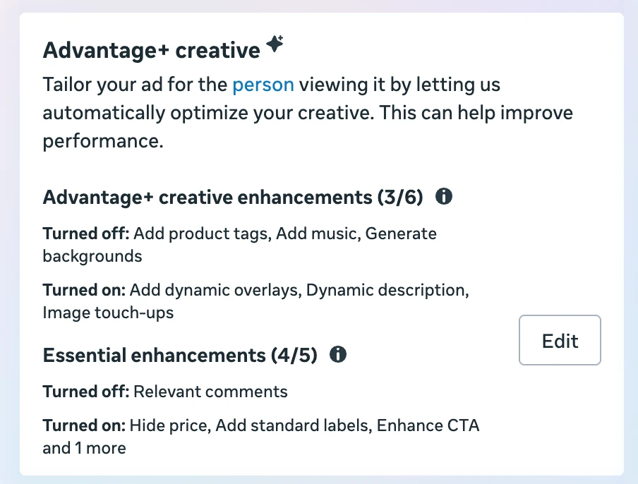
Open the box, read each switch's description and turn off anything that would cover or replace your layout. Our guide to Meta Advantage+ catalog ads explains each enhancement.
What we saw in a real account
In the Delifarm case study, the agency Clickbrains tested AI-generated catalog creatives against the store's white-background catalog ads. Over 11 days, at $5 a day per ad set, the Callout Plus style brought 44 purchases against 31, or 42% more, at a cost per purchase of $1.22 against $1.73, or 29% lower.
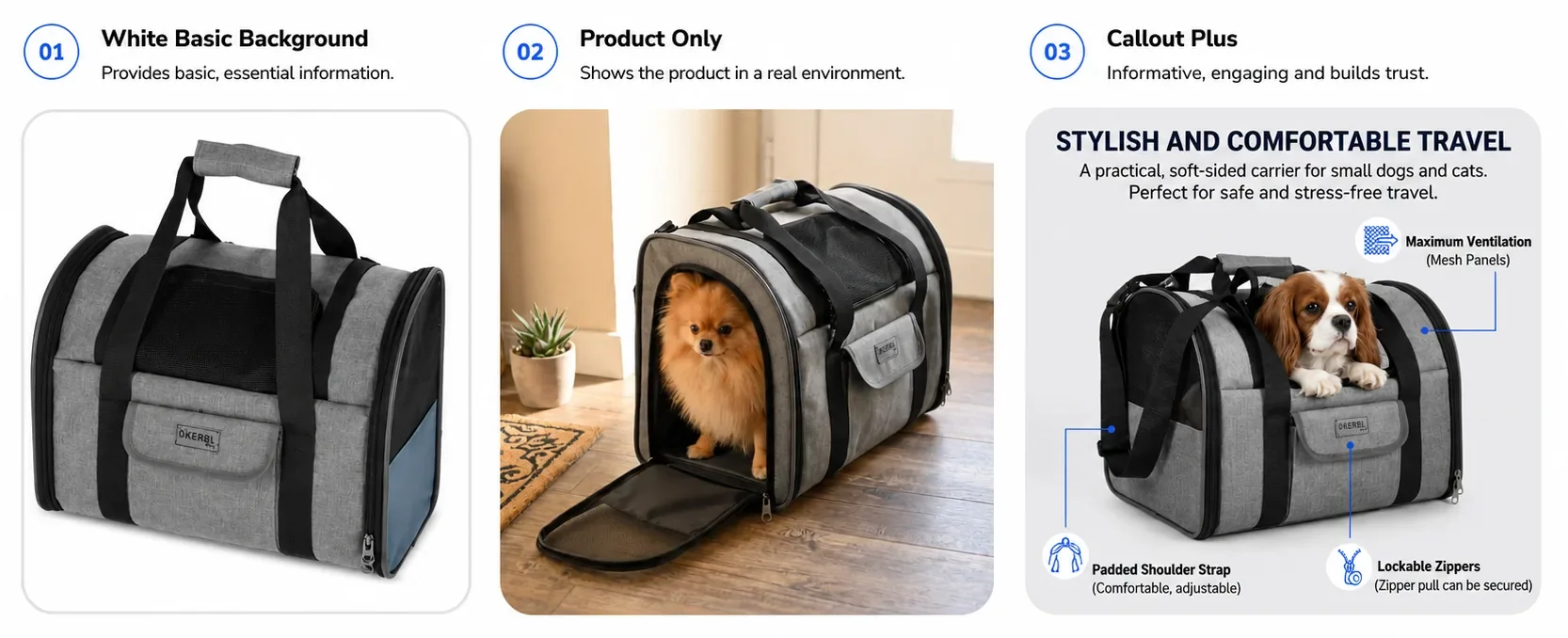
That is one store, one test and a small budget, not a benchmark. It shows the size of the difference a different image can make, and why the design is worth testing in your own account.
How to test a new catalog ad design
Keep everything the same except the image. Use one campaign and one ad set with the same product set, and two ads: the current design and the new one.
Let both run until each has enough purchases to compare, usually a week or two, and look at cost per purchase first, then click-through rate. If the new design wins, roll it out to the next product set; if it loses, change one thing and test again. The setup guide shows where the creative settings sit in the campaign.
Frequently asked questions
How do I make dynamic product ads look better than white-background product photos?
Change what the shopper sees first. Put the product in a scene they recognize, call out one feature or the price, and keep the brand recognizable. Meta's frames and image templates change the layout around the feed photo; a different image per product changes the photo itself. Test the new design against the packshot in your own account.
What is a frame in Meta catalog ads?
A frame is one graphic, such as a border or your logo, that Meta lays over every product photo in a catalog ad. Ads Manager says frames work best with a transparent background and, in the account we checked in November 2026, that a frame is only supported for ads on Facebook, not Instagram.
What are Meta image templates for catalog ads?
Image templates are Meta's own layout builder for catalog products, found in Commerce Manager under your catalog. You stack layers, such as a background, the product photo, text, shapes and catalog fields like the price, in a 1:1, 4:5 or 9:16 frame, and the same layout fills in for every product.
Should catalog ads show the price?
Show it when the price is a reason to buy: a sale, a low entry price or a bundle. Take it from the feed so it stays correct, and check your Advantage+ creative settings before you publish: one of the switches there is called Hide price. For a premium product, a feature or a scene often sells better than the number.
Do white-background product photos ever work in catalog ads?
They can, mostly for people who already viewed the product and only need a reminder. For new audiences a plain packshot looks like a listing thumbnail and gives no reason to stop. Run both versions in the same ad set for a week or two and compare cost per purchase.
What size should catalog ad images be?
Use square (1:1) as the default, portrait (4:5) for the mobile feed and 9:16 for Stories and Reels, where Meta's controls cover the top and bottom of the screen. Meta's image templates offer exactly these three shapes. Full specs are in our setup guide.
Does Advantage+ creative change my catalog ad design?
It can. Advantage+ creative enhancements can add dynamic overlays, touch up images or change the layout, and in a new campaign several of them are on by default. Open the Advantage+ creative box at the ad level, see what is on and switch off anything that would override the design you built.
Can I use a different image for each product in a catalog ad?
Yes. The catalog ad shows whatever image each product has in your feed, so a new image per product, such as a lifestyle scene or a callout version, changes every ad at once. You can add it as the main image or as an additional image and pick it with the image number in a template.
Start with the image
Every rule above comes down to the same move: give the shopper something to look at besides a packshot on white. Meta's frames and templates change the layout; a new image per product changes what the ad is about.
Browse the ad library for examples by industry and style, or start for free and generate catalog ad creatives for your own feed.